A job application is just the start
While submitting an application feels like an achievement, it’s often followed by silence, especially when the job seems like a perfect match. With multiple applications, the lack of feedback and potential ghosting can be overwhelming.
Workray
Workray steps in where job sites stop. It’s a companion tool that streamlines and organises job applications with recruiters, hiring companies, and job platforms. It extracts applications from gmail and highlights crucial details in a clear, guided format with advice, insights, and timely reminders.

Problem
Applicants often have no idea if their applications were received or acknowledged, leading to anxiety and a tendency to wait for feedback – sometimes missing out on other opportunities. That's not ideal!
Action taken
Set Clear Expectations: Give upfront communication, establishing a primary point of contact and offering rough timeframes. It’s a small but impactful improvement that applicants couldn’t find elsewhere.
Improved Feedback Loop: After a set period, applicants can request feedback from the recruiter. The recruiter receives a simple email that encourages them to update the applicant by selecting pre-canned responses. If the recruiter responds, great! The applicant gets their feedback. If not, we step in on behalf of the recruiter, encouraging the applicant to keep applying elsewhere.

Outcome
A significant drop in application update requests on the chat service (Intercom).
Users appreciated the upfront and honest advice, especially as anxiety about communication grew. There are of course multiple ways this needs to be iterated and improved.
While there’s always room for iteration, this was a big step in the right direction. If you're interested in chatting more about this, drop me a line!
Problem
After receiving an interview invite, many applicants fail to prepare adequately. Insights from user interviews and unmoderated tests revealed that they often rely on the limited information found in job adverts for preparation hints. While some may consult peer reviews on platforms like Glassdoor to gauge company culture, this practice is not common among all applicants.
Action taken
To address this issue, the existing calendar integration was enhanced by introducing a two-part interview reminder system.
First Reminder: Encourages applicants to conduct research on the job and company, providing space for insights gathered ahead of the interview.
Second Reminder: Sent the day before the interview, this reminder focuses on logistical preparation and well-wishing, omitting research prompts to prevent unnecessary anxiety if research hasn't been completed.

Outcome
After releasing an early prototype, user feedback was overwhelmingly positive. Applicants appreciated the encouragement to conduct research, which alleviated some of the preparation burden. This enhancement not only facilitated better interview readiness but also fostered a more proactive approach to applicant engagement.
Problem
Job sites aim to assist job hunters in finding the right positions, but once an application is submitted, the support often ends there. What if Workray could be seamlessly integrated into job sites to extend that support?
Action taken
To be reactive to a users job hunt, Workray requires inbox access. It was decided from day one that a job sites user should not have to grant access to an inbox to see applications made on that job site. That would be absurd!
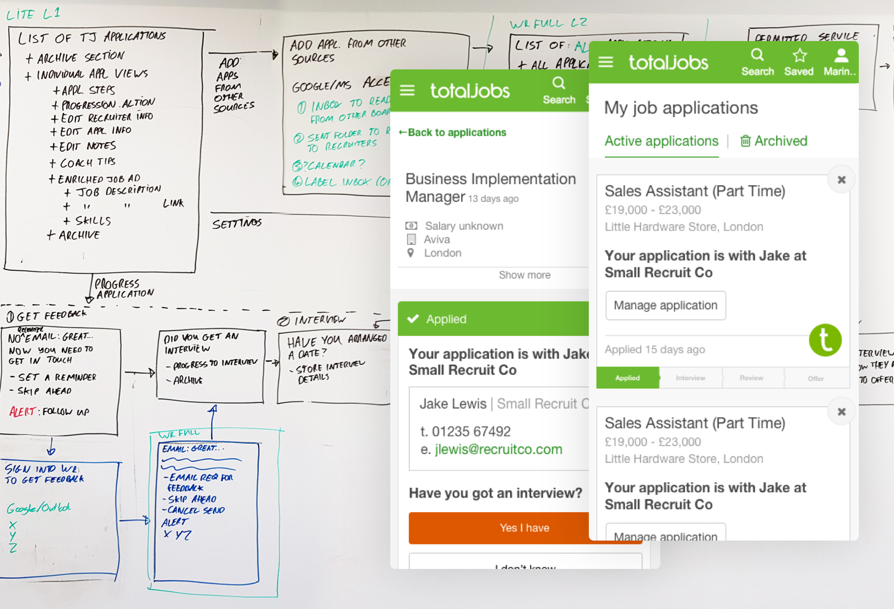
So to untangle inbox dependent features, the whole screen flow demonstrating features was re-drawn across the office walls. This allowed the whole team to join in and start breaking things down quickly.
Eventually we worked out how we could offer basic organisation features and still be useful. Users would have mostly the same experience as they would get from workray. But they could chose to later authorise the job site to import applications from other job sites, making their dashboard more reactive.
Sounds simple right? In reality it was a 6-9 month project involving multiple stakeholders across two teams with different cultures working in different offices.

Outcome
As a result of the integration, there was a notable uplift in engagement, validating core aspects of the product while also revealing areas for improvement on the roadmap. From a UX perspective, the project was a strong success. By prioritising contact details and placing clear CTAs directly after applications, we’ve streamlined the process for applicants, helping them move closer to application outcomes on the platform – creating new opportunities where previously there were none.

